OT | Digital Minimalist 2
- 3.1
- Rating
- 10.00K
- Installs
- $1.99
- Price
 Analysis by App-foxy
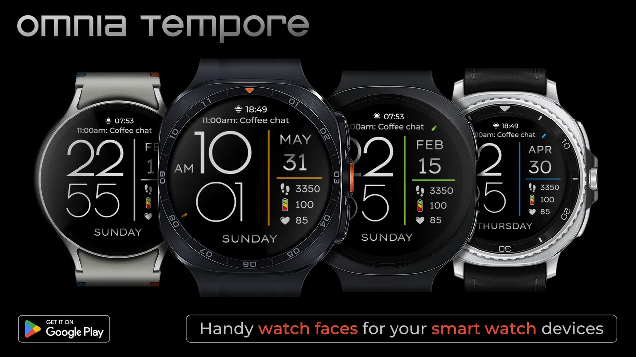
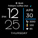
I approached OT | Digital Minimalist 2 as someone who wanted a calmer Wear OS screen rather than another decorative watch face competing for attention. From the first glance, its appeal is easy to understand: it keeps the display digital, restrained, and focused on the information I actually check during a normal day. This is a personalization app from Omnia Tempore Watch Faces, aimed at Wear OS users who prefer a clean starting point and a few useful shortcuts instead of a crowded dashboard.
The important distinction is that this is not trying to replace a full smartwatch interface. It is a watch face with customizable app shortcuts. That sounds modest, and it is, but the modesty is part of the experience. I found myself evaluating it less like a feature-packed utility and more like the front door to my watch: what do I want to see immediately, which apps do I want within one tap, and how much visual noise am I willing to tolerate?
How the watch face fits into a real daily routine
I look at this face through the small moments that make up a normal day: checking the time, then deciding whether I need to open an app or simply move on. A restrained layout can make those moments feel less cluttered, but the useful test is whether its shortcuts match what I reach for without thinking. That daily pattern also helps set realistic expectations for how quickly the face should respond.
You May Also Like

 Blood Strike: 2.5 Anniversary
Blood Strike’s Loadouts Turn Every Drop Into a Tactical Gamble
A close look at Blood Strike’s custom loadouts: how fast access to signature weapons reshapes its battle royale rhythm, rewards preparation, and narrows the gap between fights.

 Pandora - Music & Podcasts
Pandora’s Music Is Easy to Start, but Harder to Recover
Pandora’s strength is its low-effort path from a seed to a station. Its weak spot is how much confidence it asks you to place in connection, setup, and quiet recovery.

 8 Ball Pool
 Is Built on Rivalries, Rematches, and Routine
A close look at the rivalries, rematches, shared routines, and unanswered safety questions that turn a quick pool match into a persistent mobile community.

 Samsung Music
’s Quiet Strength Is Playing What You Already Own
Its reach comes less from spectacle than from dependable access to a personal library. That simplicity is both the app’s strongest retention engine and its ceiling.

 AccuWeather: Weather Radar
AccuWeather Review: A Quick, Clear Forecast for Everyday Decisions
For everyday plans, the best forecast is the one you can understand quickly. AccuWeather makes rain timing, radar, and local conditions easy to act on, with a few trade-offs.

 Hill Climb Racing
Why Hill Climb Racing Still Turns Crashes Into One More Run
A tiny car, a bumpy hill and one more upgrade: Hill Climb Racing keeps resurfacing because its simple chaos makes every near-miss feel personal.
More From Our News Desk
View All News


Starting with a specific problem
The best reason to use this face is not simply “I like minimal design.” The stronger reason is having a recurring wrist-based task that you want to reach quickly. For example, I might check a timer while cooking, open a fitness app before a walk, or launch a music control app during a commute. With the usual default face, those actions can involve waking the watch, navigating through tiles, or searching through the app list. A shortcut-oriented face changes that starting point.
I also like the separation between the clock and the rest of the watch. A digital layout is generally faster to read than an ornate analog design when I am glancing at my wrist for only a second. That matters when I am carrying groceries, crossing a street, or trying not to interrupt a conversation. The face does not ask me to interpret much before I know the time.
At the same time, I would not install it just because it is categorized under personalization. Its value depends on whether the watch face’s visual restraint matches your habits. If you want elaborate complications, animated decoration, or a large amount of information permanently visible, this is probably the wrong starting condition. The design is most convincing when your goal is to reduce decisions, not add more of them.
The setup flow and the first useful decision
After installing the app, the practical job is choosing it as the active watch face and then adjusting the available app shortcuts to suit your routine. The key decision is not to fill every available position automatically. I get more from assigning shortcuts to actions I repeat often than from selecting impressive-looking apps I rarely open.
My preferred approach is to think in pairs: one shortcut for an immediate action and another for a different context. A timer and a workout app make sense for an active day. Music and navigation are more useful for commuting. If I am using the watch mainly for notifications, I would choose the app I open most often after seeing an alert rather than trying to build a miniature phone menu on the wrist.
This is one of the less obvious strengths of the design: customization becomes more useful when it is treated as workflow planning. The face is not valuable because every shortcut is occupied. It is valuable when the shortcuts reflect what I would otherwise have to hunt for. A small number of well-chosen actions can make the watch feel faster than a busier face.
Moving from the clock to an app
In daily use, the flow is straightforward. I glance at the time, identify the shortcut I need, and tap through to the selected app. That handoff is the central experience. The face is not doing the work of the destination app; it is reducing the distance between seeing the watch and starting that task.
That distinction also explains why the app feels different from a conventional watch face with decorative complications. A complication usually presents a small piece of changing information, such as weather or activity data. A shortcut is more action-oriented. It is useful when I already know what I want to do and would rather open the relevant app directly.
There is a trade-off here. A shortcut can be quicker than navigating through the app launcher, but it also takes up visual and interaction space that could have been used for more at-a-glance information. I would not assign a shortcut to an app that I only open once a week. The face works best when every visible choice earns its place through repetition.
Choosing shortcuts around handoffs
The most realistic workflow often involves a handoff from one device or activity to another. I might begin a route on my phone, then use the watch for quick checks. I might start a playlist elsewhere and want a wrist-level way to reach the music app. Or I might receive a notification on the watch and need to move into the matching app without returning to the phone.
OT | Digital Minimalist 2 is useful in these moments because the watch face stays in the middle of the process. It gives me a stable launch point before I enter another app. That makes the face feel less like decoration and more like a personal index of the watch functions I actually use.
Still, the handoff is only as smooth as the app at the other end. A shortcut does not make an app faster once it has opened. If the destination app has a slow interface, requires several more taps, or is awkward on a small display, the benefit is limited. I therefore recommend assigning shortcuts to apps with a clear first screen and a task I can finish comfortably on the watch.
A practical morning example
Imagine a weekday morning where I am leaving home quickly. I check the time on the face, tap into a weather or travel-related app, and decide whether I need an extra layer or a different route. Later, I may use another shortcut to start a workout or control audio. The result is not a dramatic transformation; it is a series of small reductions in friction.
That is exactly where the minimalist approach makes sense. I am not stopping to admire the face or browse through settings. I am using it as a quiet launch surface. The clock remains readable while the shortcuts support the next action. Once the routine becomes familiar, the watch requires less thought because the important destinations are placed where I expect them.
For someone who checks several kinds of information before leaving home, a richer face with weather, calendar, battery, and activity complications may still be better. My morning example works because I value direct access more than having every status item visible simultaneously. The choice depends on whether your first need is “tell me more now” or “let me get to one app quickly.”
What the customization is really good for
The customization is most effective when it follows a role-based setup. I would create a small mental map: one position for health or exercise, one for communication, one for media, and one for a utility I use repeatedly. Even if the face offers more flexibility than I need, this method prevents the watch from becoming a collection of random entry points.
Another useful tip is to reassess the shortcuts after a few days of normal use. The apps I assume I will need are not always the apps I reach for. If I repeatedly open the app list to find one particular tool, that is evidence that the face should be adjusted. If I never tap a shortcut, it is taking up attention without returning anything.
This makes the app surprisingly personal despite its simple appearance. The face itself stays restrained, while the shortcut arrangement reflects my habits. I would not call that deep customization in the same sense as a highly elaborate design editor, but it is practical customization: changing the watch to match behavior rather than changing it merely for visual novelty.
Where it compares well with usual alternatives
The obvious alternative is the watch face already installed on a Wear OS device. Default faces often provide a balanced mixture of time, date, battery, activity, and other information. They are a safe choice for someone who wants broad coverage without spending time configuring anything. OT | Digital Minimalist 2 is better when I want a more deliberate, uncluttered layout and direct access to selected apps.
A second alternative is a complication-heavy face. That approach is stronger for monitoring several changing values without opening apps. If I need to see weather, steps, appointments, and battery at once, a data-dense face can be more efficient. The minimalist design wins when those details would distract me or when I would rather open the relevant app only when needed.
There are also highly artistic watch faces that prioritize personality. They can make the watch feel more like an accessory, while this face is more functional and reserved. I would choose the artistic option for visual expression and this one for a dependable everyday surface. Neither approach is universally superior; they serve different moods and routines.
The final comparison is with using the app launcher directly. The launcher offers access to everything, but that breadth creates a search step. The shortcut arrangement narrows the choice to the apps I intentionally placed there. That is faster for repeated tasks, though less flexible when I need something outside my selected group.
Where the flow breaks down
The main limitation is the same quality that makes the face appealing: it is intentionally simple. Users expecting a large information panel may find it too restrained. If your watch is primarily a health monitor, travel tool, or notification center, you may want more visible data than this design is meant to provide.
There is also a mental cost to customization. I have to remember which shortcut occupies which position. That is easy when the arrangement matches a stable routine, but less convenient when I change activities frequently. A face that shows recognizable data directly can be easier for occasional use because I do not need to remember a personal shortcut map.
Another possible friction point is the difference between launching an app and completing a task. A shortcut gets me to the next screen, but it cannot simplify an app that was not designed well for Wear OS. For quick actions, that is fine. For complicated forms, detailed browsing, or long interactions, I still prefer using the phone. The face should be viewed as an efficient handoff, not a promise that every task becomes wrist-friendly.
The price is also worth considering. At $1.99, this is a paid personalization app rather than a no-cost experiment. I think that makes sense for someone who will use the shortcuts every day, but it is harder to justify if I change watch faces constantly or only want to test a minimalist style for a few minutes. The purchase decision should come from a clear routine, not from curiosity alone.
What the public response suggests
The app has an average rating of 3.1 from around 70 ratings, with around 12 written reviews, and it has passed 10K installs. I read those figures as a sign to keep expectations measured. There is enough usage to show that the concept has found an audience, but the rating does not support treating it as an automatic recommendation for every Wear OS owner.
For me, the rating makes the fit question more important. A simple watch face can feel excellent when its layout and shortcuts match my habits, yet underwhelming when I want extensive information or more visual control. The app should be judged by that specific use case rather than by the idea that minimalism is always better.
Who should use it and who should pass
I would recommend it to a Wear OS owner who wants a clean digital clock and a short list of personalized app entry points. It is especially suitable for people who repeat the same wrist-based actions every day and dislike navigating through several screens to reach them. It can also suit someone who wants a quiet, low-distraction presentation instead of a face packed with counters and status indicators.
I would suggest skipping it if you need extensive live information on the main screen, enjoy frequently changing visual themes, or expect a watch face to manage complex tasks by itself. It is also not the strongest choice for someone who rarely opens apps from the watch. In that case, the shortcut feature may not justify replacing a familiar default face.
Before buying, I would make a short list of the apps I genuinely open from my watch. If that list is small but repeated often, the design has a clear purpose. If the list is long and constantly changing, a general launcher or a complication-rich face may be more practical. This simple test gives a better answer than choosing based only on the word “minimalist.”
The outcome after settling into the layout
Once the shortcut arrangement reflects my routine, the outcome is a watch face that stays out of the way while making a few actions easier to reach. I do not get a dramatic collection of new smartwatch capabilities, and that is not the point. I get a more intentional starting screen, with the clock first and selected apps close behind.
My honest view is that OT | Digital Minimalist 2 succeeds when treated as a focused workflow tool rather than a complete smartwatch command center. The developer, Omnia Tempore Watch Faces, has chosen a narrow idea: make the digital face calm, then let the wearer decide which app doors should be nearby. That narrowness is both its identity and its biggest constraint.
The app is suitable for Everyone and was released on Jul 13, 2023. Those details make it approachable for a broad audience, but they do not change the central decision: do you want fewer visible distractions and faster access to a chosen set of apps? If yes, the paid price can be reasonable for a daily-use face. If not, the standard face or a more information-rich alternative will probably serve you better.
I would install it when my starting condition is a cluttered or inconvenient watch screen, configure shortcuts around real habits, and judge the result by how often I avoid the app launcher. If that handoff becomes natural, the face earns its place. If I keep searching for information that is not visible or opening apps that were not assigned, the flow has already shown me that I need a different kind of Wear OS face.
FAQs for OT | Digital Minimalist 2
01What is OT | Digital Minimalist 2, and what does it do?
OT | Digital Minimalist 2 is designed to help you reduce unnecessary phone use and build healthier digital habits. It typically focuses on limiting distracting applications, encouraging intentional screen time, and giving you a clearer view of how you use your device. Before downloading, remember that its effectiveness depends on configuring realistic limits and consistently following the routines it suggests.
02How does OT | Digital Minimalist 2 limit distracting apps?
The app generally works by allowing you to select applications or categories that you consider distracting, then applying restrictions according to your chosen schedule or daily allowance. Depending on your device and settings, it may use Android accessibility, usage-access, notification, or screen-time permissions. These permissions are important for the app to function, so review them carefully before enabling restrictions.
03Does OT | Digital Minimalist 2 require special permissions or access to personal data?
A digital-wellbeing app may request access to app usage statistics, notifications, accessibility features, or device settings so it can monitor habits and enforce limits. These permissions can feel extensive because the app needs system-level information to work properly. Before installing, read its privacy policy and the permissions shown in the official store, especially if privacy and data collection are major concerns for you.
04Can I still use essential apps while OT | Digital Minimalist 2 is active?
Yes, the experience is intended to be customizable, so users can usually create exceptions for essential tools such as phone, messages, maps, banking, work, or school applications. However, the exact options may depend on your operating system and the version installed. It is best to configure your allowed apps carefully during setup, otherwise important services could become inconvenient to access.
05Is OT | Digital Minimalist 2 free to download, and is it suitable for everyone?
The app may be available to download at no initial cost, but some features could depend on premium access, subscriptions, or in-app purchases. Check the current Google Play Store or App Store listing for pricing, trial details, and supported devices because these can change. It is suitable for people seeking better focus, although users who need unrestricted access or dislike system permissions may find it limiting.
Pros
- Helps reduce impulsive app opening and mindless scrolling.
- Simple interface makes daily usage limits easy to understand.
- Useful focus tools support study
- work
- and screen-free routines.
- Encourages healthier phone habits without requiring social features.
- Can make distracting apps less visible and harder to access.
Cons
- Some restrictions may feel inconvenient during urgent situations.
- Effectiveness depends heavily on personal commitment and consistency.
- Advanced controls may require time to configure properly.
- Certain features could be limited by Android or iOS system rules.
- Users may need to adjust settings frequently as routines change.

OT | Digital Minimalist 2
Gallery